


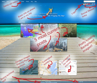
The new home page
What the hell Todd, Why the complete change to the website? I know change is ofttimes a shock to the system, but there were issues piling up. User experiences, Google analytics, Amazon, and well the old layout just wasn’t as inspiring as I had hoped. Adding all this up, it was obvious my sad little website was crying out for some much needed TLC.
At first I tried to address each of these issues individually. That quickly spiraled out of control into what I can only describe as a complete hot mess of failure.
The first thing that needed to be addressed was the confusion in the two post stream setup.
Originally I had envisioned there to be two post streams one with in-depth posts about boat life and another with random little bits of off-the-cuff commentary. Think something like a Facebook feed and a twitter feed all on the same page. In theory this sounded good, but I had laid out the page so that the slow moving blog posts were at the top and the more frequent commentary posts were at the bottom, below the fold (web speak for you had scroll down to see them). This was causing people to think the page was not being updated and going some place else.
The other problem with the old layout, while information dense, it was cluttered and dated. It really didn’t get anyone excited about travel, sailing, cruising, boats, or life on the ocean. Totally unacceptable. The main reasons for putting in all the upkeep of this website was to inspire people’s dreams and wonder lust. Give them motivation and ideas about a life outside the rat race.
As you can see things were pushing me toward a new user experience and that is what compelled me to drop my current boat projects and do some emergency triage on the website.
My marching orders were pretty straight forward, remove the clutter, put post activity up front and center, and most importantly, swing for the bleachers and inspire.
I don’t know about you but the first order of business in any reorganization project whether it’s a closet, the garage or the sail locker is to clear out the clutter!!!!
The footer and the sidebar were the worst offenders in the clutter department, they needed some ruthless editing. The footer got almost completely gutted. After doing research on website footer content it became obvious that for the most part the only things that should be there were the jibber-jabber that no one reads. So I pared it down to just the bare minimum, it was a start.
The side-bar was next, since the home page was the front door and the place, this is were I really wanted to grab visitor’s imagination I decided it really didn’t even need to be there…Gone!!!
That opened up all kinds of space to put important stuff like: pictures, posts, maps, and excitement. Nothing grabs people’s imagination like big beautiful pictures, lets fill the entire background with that!!
One piece of information I personally think needs to be displayed is what the hell is my current status. I see so many travel and sailing blogs but I have to idea where they are in their travels. Are they sailing, are they even on the boat, are they at the bar on a 3 day island bender? So we definitely need to convey my current status lets start with that.
Next up was where to put the posts. Front and center right where people can see them, that’s where. But lets not go overboard here, the five most current posts should be enough to give visitors an idea of where to click next.
Off to good start I think, but we need more inspirational pictures. Oh and we need a map so people can figure out where in the world this is all occurring. To balance that all out, lets throw in the twitter feed for more ramblings and funny shenanigans.
That’s enough to round out the home page. Oh wait this is the 21st century, we ‘have’ to put up social media stuff. Ok nothing big, just some small icons in the corner, that will cover that base. I think the home page is done and to quote my nephew “Looks a thousand bazillion million times much better!”
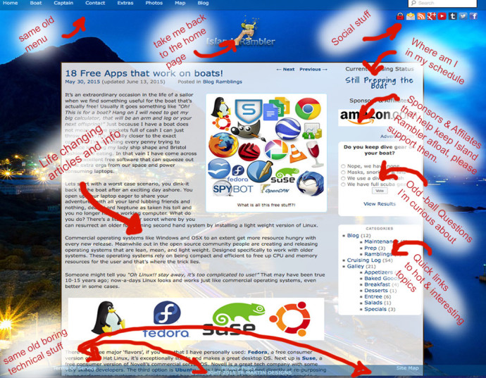
The new content page
The side-bar is still a little cluttered so it needed some editing. The ‘current status’ needs to stay. Advertising definitely needs to be kept. My sponsors and affiliates are what’s keeping this whole endeavor rolling. The category list I find very handy for visitors. Everything else ‘DELETE’. Not bad, things are looking tidy and clean.
There are still a few things that are annoying me. The bridge between my Instagam account and the website only posts one title ‘Ramblings from Instagram’, that’s getting really repetitive and totally uninspirational. The map needs to automagically update itself when I update my status.
First up was the Instagram problem, a little hack-ware and I can now embed fun and entertaining titles. Glad to get that repetitive nonsense out off the website. The second problem was the home page map. I added some more hack-ware to the map page update and used Google’s static map API to automatically produce a nice current positioning image. DONE!!!!!
There you have it… What I hope is a simpler, cleaner, and inspirational website. I hope you enjoy it.
Cheers, Island Rambler

The site update looks great! It was nice to meet you and we had a great time on our little trip.
Thanks for the lessons too! Next time I’ll wear proper foot attire. 🙂
Cheers!
Nice to meet you too Alan,
You’ll have to pester Ivor for more sailing excursions. But be careful he has a tendency to make you do all the hard work while he sips a beer and oversees..
Cheers,
Todd